सीएसएस टेक्स्ट-ओवरफ्लो एक टेबल सेल में?


499

मैं text-overflowएक तालिका सेल में सीएसएस का उपयोग करना चाहता हूं , जैसे कि यदि पाठ एक पंक्ति में फिट होने के लिए बहुत लंबा है, तो यह कई लाइनों से लपेटने के बजाय एक दीर्घवृत्त के साथ क्लिप करेगा। क्या यह संभव है?

मैंने यह कोशिश की:

td {
  overflow: hidden;
  text-overflow: ellipsis;
  white-space: nowrap;
}

लेकिन white-space: nowrapलगता है कि पाठ (और इसके सेल) को लगातार अपने कंटेनर की चौड़ाई से परे तालिका की कुल चौड़ाई को धकेलते हुए, दाईं ओर विस्तृत किया गया है। इसके बिना, हालांकि, यह सेल के किनारे से टकराकर टेक्स्ट को कई लाइनों में लपेटता रहता है।


9
टेबल सेल 
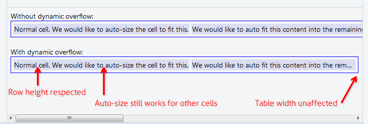
overflowअच्छी तरह से संभाल नहीं है । सेल में एक div डालने की कोशिश करें और उस div को स्टाइल करें।
श्री लिस्टर

जवाबों:


897

पाठ को क्लिप करने के लिए एक दीर्घवृत्त के साथ जब यह एक तालिका सेल को ओवरफ्लो करता है, तो आपको काम करने के लिए अतिप्रवाह के लिए max-widthप्रत्येक tdवर्ग पर सीएसएस संपत्ति सेट करना होगा। कोई अतिरिक्त लेआउट div की आवश्यकता नहीं है

td {
    max-width: 100px;
    overflow: hidden;
    text-overflow: ellipsis;
    white-space: nowrap;
}

उत्तरदायी लेआउट के लिए; max-widthकॉलम की प्रभावी न्यूनतम चौड़ाई को निर्दिष्ट करने के लिए सीएसएस संपत्ति का उपयोग करें, या बस max-width: 0;असीमित लचीलेपन के लिए उपयोग करें । इसके अलावा, युक्त तालिका को एक विशिष्ट चौड़ाई की आवश्यकता होगी, आम तौर पर width: 100%;, और कॉलम में आमतौर पर कुल चौड़ाई के प्रतिशत के रूप में उनकी चौड़ाई निर्धारित की जाएगी

table {
    width: 100%;
}
td {
    max-width: 0;
    overflow: hidden;
    text-overflow: ellipsis;
    white-space: nowrap;
}
td.columnA {
    width: 30%;
}
td.columnB {
    width: 70%;
}

ऐतिहासिक: IE 9 (या उससे कम) के लिए आपको अपने HTML में यह करना होगा, IE- विशिष्ट प्रतिपादन समस्या को ठीक करने के लिए

<!--[if IE]>
<style>
    table {
        table-layout: fixed;
        width: 100px;
    }
</style>
<![endif]-->

7
IE में काम करने के लिए तालिका को भी चौड़ाई की आवश्यकता होती है। jsfiddle.net/rBthS/69
ट्रेवर डिक्सन

1
यदि आप सेट करते हैं width: 100%;और min-width: 1px;सेल हमेशा जितना संभव हो उतना चौड़ा होगा और केवल पाठ को रौंदने के लिए दीर्घवृत्त का उपयोग करेगा जब इसे करने की आवश्यकता होती है (न कि जब तत्व चौड़ाई एक निश्चित आकार को हिट करती है) - यह उत्तरदायी लेआउट के लिए बहुत उपयोगी है।
डंकन वाकर

2
@OzrenTkalcecKrznaric यह display: table-cellवास्तव में काम करता है, लेकिन तब नहीं जब इसे max-widthप्रतिशत (%) में परिभाषित किया गया हो। एफएफ 32 पर परीक्षण किया गया
ग्रेग

14
(ऊपर बताए अनुसार) जिस मामले में आप% मानों का उपयोग करते हैं, उसके बाद ही table-layout: fixedतत्व पर प्रयोग कर display: tableचाल
ग्रेग

1
कैसे के बारे में यदि आप चाहते हैं कि कॉलम की चौड़ाई बूटस्ट्रैप उत्तरदायी तालिका की तरह उत्तरदायी फैशन पर स्वचालित रूप से असाइन की जाए? अधिकतम-चौड़ाई सेट करने से उस पर नियंत्रण समाप्त हो जाएगा। क्या आसपास कोई काम है?
घोंसला

81

एक max-widthया निश्चित चौड़ाई निर्दिष्ट करना सभी स्थितियों के लिए काम नहीं करता है, और तालिका को तरल पदार्थ और ऑटो-स्पेस अपनी कोशिकाओं को होना चाहिए। तालिकाओं के लिए क्या है।

इसका उपयोग करें: http://jsfiddle.net/maruxa1j/

HTML:

<td class="ellipsis">
    <span>This Text Overflows and is too large for its cell.</span>
</td>

सीएसएस:

.ellipsis {
    position: relative;
}
.ellipsis:before {
    content: '&nbsp;';
    visibility: hidden;
}
.ellipsis span {
    position: absolute;
    left: 0;
    right: 0;
    white-space: nowrap;
    overflow: hidden;
    text-overflow: ellipsis;
}

IE9 और अन्य ब्राउज़रों पर काम करता है।


नोट: यह समाधान <span>तत्वों में सेल सामग्री को लपेटता है ।
रॉय टिंकर

2
यह वास्तव में चतुर समाधान है, और उन सभी तालिकाओं के लिए अच्छी तरह से काम करता है जिनके लिए मुझे समाधान की आवश्यकता होगी। हालाँकि आपको चौड़ाई सेट करने की आवश्यकता होती है यदि आप नहीं चाहते कि सभी तालिका कोशिकाएँ समान चौड़ाई की हों।
केविन बील

जब कोई निश्चित चौड़ाई नहीं होती है, तो यह समाधान सबसे अच्छा काम करता है। वास्तव में बहुत चालाक!
9

1
यह ऊर्ध्वाधर संरेखण रखता है जब अन्य समाधान की तरह display: blockनहीं था
j3ff

बस सबसे अच्छा समाधान कभी! बहुत ही सरल। बहुत बहुत धन्यवाद।
क्लाउनकोडर

39

ऐसा क्यों होता है?

ऐसा लगता है कि w3.org पर यह खंड बताता है कि टेक्स्ट-ओवरफ्लो केवल ब्लॉक तत्वों पर लागू होता है :

11.1.  Overflow Ellipsis: the ‘text-overflow’ property

text-overflow      clip | ellipsis | <string>  
Initial:           clip   
APPLIES TO:        BLOCK CONTAINERS               <<<<
Inherited:         no  
Percentages:       N/A  
Media:             visual  
Computed value:    as specified  

MDN ही कहते हैं

इस jsfiddle में आपका कोड है (कुछ डिबग संशोधनों के साथ), जो ठीक काम करता है अगर इसे एक के divबजाय लागू किया जाता है td। इसमें एकमात्र वर्कअराउंड भी है जिसे मैं जल्दी से सोच सकता था, tdजिसमें एक divब्लॉक में सामग्री को लपेटकर । हालांकि, यह मेरे लिए "बदसूरत" मार्कअप जैसा दिखता है, इसलिए मैं उम्मीद कर रहा हूं कि किसी और के पास बेहतर समाधान है। इसको देखने के लिए कोड इस तरह दिखता है:

td, div {
  overflow: hidden;
  text-overflow: ellipsis;
  white-space: nowrap;
  border: 1px solid red;
  width: 80px;
}
Works, but no tables anymore:
<div>Lorem ipsum and dim sum yeah yeah yeah. Lorem ipsum and dim sum yeah yeah yeah. Lorem ipsum and dim sum yeah yeah yeah. Lorem ipsum and dim sum yeah yeah yeah. Lorem ipsum and dim sum yeah yeah yeah.</div>

Works, but non-semantic markup required:
<table><tr><td><div>Lorem ipsum and dim sum yeah yeah yeah. Lorem ipsum and dim sum yeah yeah yeah. Lorem ipsum and dim sum yeah yeah yeah. Lorem ipsum and dim sum yeah yeah yeah. Lorem ipsum and dim sum yeah yeah yeah.</div></td></tr></table>


2
अच्छा धन्यवाद। मैं अपने मार्कअप से टेबल सेल्स को हटा नहीं सका, इसलिए मैंने सिर्फ डिव में कंटेंट को लपेटा (उनकी चौड़ाई कोशिकाओं की चौड़ाई के साथ सेट की गई) और इसके बजाय वहां पर ओवरफ्लो लागू किया। एक जादू की तरह काम किया!
डेग्यु

28

मामले में आप कुछ भी तय चौड़ाई निर्धारित नहीं करना चाहते हैं

नीचे दिए गए समाधान से आपको टेबल सेल सामग्री मिल सकती है जो लंबी है, लेकिन पैरेंट टेबल की चौड़ाई को प्रभावित नहीं करना चाहिए, न ही पैरेंट पंक्ति की ऊंचाई। उदाहरण के लिए जहां आप एक तालिका रखना चाहते हैं, width:100%वह अभी भी अन्य सभी कोशिकाओं पर ऑटो-आकार की सुविधा लागू करती है। "नोट्स" या "टिप्पणी" कॉलम या कुछ और के साथ डेटा ग्रिड में उपयोगी।

यहाँ छवि विवरण दर्ज करें

अपने CSS में इन 3 नियमों को जोड़ें:

.text-overflow-dynamic-container {
    position: relative;
    max-width: 100%;
    padding: 0 !important;
    display: -webkit-flex;
    display: -moz-flex;
    display: flex;
    vertical-align: text-bottom !important;
}
.text-overflow-dynamic-ellipsis {
    position: absolute;
    white-space: nowrap;
    overflow-y: visible;
    overflow-x: hidden;
    text-overflow: ellipsis;
    -ms-text-overflow: ellipsis;
    -o-text-overflow: ellipsis;
    max-width: 100%;
    min-width: 0;
    width:100%;
    top: 0;
    left: 0;
}
.text-overflow-dynamic-container:after,
.text-overflow-dynamic-ellipsis:after {
    content: '-';
    display: inline;
    visibility: hidden;
    width: 0;
}

HTML को किसी भी तालिका सेल में इस तरह से प्रारूपित करें कि आप डायनामिक टेक्स्ट ओवरफ़्लो चाहते हैं:

<td>
  <span class="text-overflow-dynamic-container">
    <span class="text-overflow-dynamic-ellipsis" title="...your text again for usability...">
      //...your long text here...
    </span>
  </span>
</td>

इसके अतिरिक्त min-widthटेबल सेल में वांछित (या कोई भी नहीं) लागू करें ।

बेशक बेला: https://jsfiddle.net/9wycg99v/23/


सबसे सहायक उत्तर, डायनेमिक एलिप्सिस अभी कमाल का है।
लूसिफ़ेर 63

यह हर कॉलम की चयनित चौड़ाई सीमा को गड़बड़ कर देता है, उदाहरण के लिए यदि आपके पास कुछ कॉलम परिभाषित हैं जो max-width: Xअब व्यापक हो सकते हैं - मुझे लगा कि इसका display: flexउपयोग होने के कारण है, लेकिन मैंने इसे हटा दिया और कोई अंतर नहीं देखा ...
user9645

24

ऐसा लगता है कि यदि आप तत्व table-layout: fixed;पर निर्दिष्ट करते हैं table, तो आपकी शैलियों को tdप्रभावी होना चाहिए। यह भी प्रभावित करेगा कि कोशिकाओं का आकार कैसा है, हालांकि।

साइटपॉइंट टेबल-लेआउट के तरीकों पर थोड़ी चर्चा करता है: http://reference.sitepoint.com/css/tableformatting


2
जब आप तालिका की चौड़ाई निर्दिष्ट नहीं करना चाहते हैं तो यह सही उत्तर होना चाहिए।
एड्रियन

20

अगर आप सिर्फ टेबल को ऑटो-लेआउट के लिए चाहते हैं

max-widthस्तंभ की चौड़ाई, या table-layout: fixedआदि का उपयोग किए बिना , या प्रतिशत

https://jsfiddle.net/tturadqq/

यह काम किस प्रकार करता है:


चरण 1: बस तालिका ऑटो-लेआउट को अपनी बात करने दें।

जब बहुत सारे पाठ के साथ एक या अधिक स्तंभ हों, तो यह अन्य स्तंभों को जितना संभव हो उतना छोटा कर देगा, फिर लंबे स्तंभों के पाठ को लपेटें:

यहाँ छवि विवरण दर्ज करें


चरण 2: एक div में सेल सामग्री लपेटें, फिर उस div को सेट करें max-height: 1.1em

(अतिरिक्त 0.1em उन वर्णों के लिए है जो पाठ आधार से थोड़ा नीचे प्रस्तुत करते हैं, जैसे 'g' और 'y' की पूंछ)

यहाँ छवि विवरण दर्ज करें


चरण 3: titledivs पर सेट करें

यह एक्सेसिबिलिटी के लिए अच्छा है, और एक पल में हम जिस छोटी ट्रिक का उपयोग करेंगे, उसके लिए यह आवश्यक है।

यहाँ छवि विवरण दर्ज करें


चरण 4: ::afterdiv पर एक सीएसएस जोड़ें

यह मुश्किल बिट है। हम एक CSS सेट ::afterकरते हैं content: attr(title), उसके साथ , फिर div और सेट के ऊपर स्थिति text-overflow: ellipsis। मैंने इसे स्पष्ट करने के लिए इसे यहाँ लाल रंग में रंगा है।

(ध्यान दें कि अब लंबे कॉलम में टेलिंग इलिप्सिस है)

यहाँ छवि विवरण दर्ज करें


चरण 5: div पाठ का रंग सेट करें transparent

और हम कर रहे हैं!

यहाँ छवि विवरण दर्ज करें


2
यह कमाल और सही समाधान है! मुझे आश्चर्य है कि अधिकांश अपवोटों के बजाय इसे नकारात्मक वोट क्यों मिला है !!
ज़ेंडू

2
ज़बर्दस्त मर्द! (@ user9645 - यह सही नहीं है: क्या यह Vue.js के साथ प्रदान की गई एक तालिका के साथ काम कर रहा है - इस शीर्षक को div पर नहीं, td पर रखना सुनिश्चित करें)
क्रिश्चियन Opitz

@ChristianOpitz - हां, मैंने इसे किसी तरह गड़बड़ कर दिया होगा ... इसे वापस ले लिया और यह काम कर रहा है।
user9645

मैंने देखा कि टेबल सेल <a>के <div>अंदर का उपयोग करते समय यह दृष्टिकोण विफल हो जाता है । जोड़ा जा रहा है word-break: break-all;हल समस्या। उदाहरण: jsfiddle.net/de0bjmqv
zendu

सिर्फ महान। और आपके पास कोशिकाओं में समान पाठ होने की भी आवश्यकता नहीं है (शीर्षक पर्याप्त हैं), और फिर आपको अधिकतम ऊंचाई की आवश्यकता नहीं है: 1.1em आदि - जो आपको divs की आवश्यकता है वह स्थिति है: रिश्तेदार;)
KS74

13

जब यह प्रतिशत तालिका चौड़ाई में है, या आप तालिका सेल पर निश्चित चौड़ाई निर्धारित नहीं कर सकते। आप table-layout: fixed;इसे काम करने के लिए आवेदन कर सकते हैं।

table {
  table-layout: fixed;
  width: 100%;
}
td {
  text-overflow: ellipsis;
  white-space: nowrap;
  overflow: hidden;
  border: 1px solid red;
}
<table>
  <tr>
    <td>Lorem ipsum and dim sum yeah yeah yeah. Lorem ipsum and dim sum yeah yeah yeah. Lorem ipsum and dim sum yeah yeah yeah. Lorem ipsum and dim sum yeah yeah yeah. Lorem ipsum and dim sum yeah yeah yeah.</td>
    <td>Lorem ipsum and dim sum yeah yeah yeah. Lorem ipsum and dim sum yeah yeah yeah. Lorem ipsum and dim sum yeah yeah yeah. Lorem ipsum and dim sum yeah yeah yeah. Lorem ipsum and dim sum yeah yeah yeah.</td>
  </tr>
</table>


5

एक फ्लेक्स ब्लॉक में सेल सामग्री लपेटें। एक बोनस के रूप में, सेल ऑटो दृश्यमान चौड़ाई में फिट बैठता है।

table {
  width: 100%;
}

div.parent {
  display: flex;
}

div.child {
  flex: 1;
  width: 1px;
  overflow-x: hidden;
  text-overflow: ellipsis;
}
<table>
  <tr>
    <td>
      <div class="parent">
        <div class="child">
          xxxxxxxxxxxxxxxxxxxxxxxxxxxxxxxxxxxxxxxxxxxxxxxxxxxxxxxxxxxxxxxxxxxxxxxxxxxxxxxxxxxxxxxxxxxxxxxxxxxxxxxxxxxxxxxxxxxxxxxxxxxxxxxxxxxxxxxxxxxxxxxxxxxxxxxxxxxxxxxxxxxxxxxxxxxxxxxxxxxxxxxxxxxxxxxxxxxxxxxxxxxxxxxxxxxxxxxxxxxxxxxxxxxxxxxxxxxxxxxxxxxxxxxxxxxxxxxxxxxxxxxxxxxxxxxxxxxxxxxxxxxxxxxxxxxxxxxxxxxxxxxxxxxxxxxxxxxxxxxxxxxxxxxxxxxxxxxxxxxxxxxxxxxxxxxxxxxxxxxxxxxxxxxxxxxxxxxxxxxxxxxxxxxxxxxxxxxxxxxxxxxxxxxxxxxxxxxxxxxxxxxxxxxxxxxxxxxxxxxxxxxxxxxxxxxxxxxxxxxxxxxxxxxxxxxxxxxxxxxxxxxxxxxxxxxxxxxxxxxxxxxxxxxxxxxxxxxxxxxxxxxxxxxxxxxxxxxxxxxxxxxxxxxxxxxxxxxxxxxxxxxxxxxxxxxxxxxxxxxxxxxxxxxxxxxxxxxx
        </div>
      <div>
    </td>
  </tr>
</table>


3
मैं भी जोड़ने के लिए किया था white-space: nowrap;के लिए childवर्ग।
रॉस एलन

3

मैंने इसे सेल (रिश्तेदार) के अंदर एक बिल्कुल तैनात div का उपयोग करके हल किया।

td {
    position: relative;
}
td > div {
    position: absolute;
    white-space: nowrap;
    overflow: hidden;
    text-overflow: ellipsis;
    max-width: 100%;        
}

बस। फिर आप या तो एक शीर्ष जोड़ सकते हैं: div के लिए मान या लंबवत केंद्र:

td > div {      
    top: 0;
    bottom: 0;
    margin: auto 0;
    height: 1.5em; // = line height 
}

दाईं ओर कुछ जगह पाने के लिए, आप अधिकतम-चौड़ाई को थोड़ा कम कर सकते हैं।


यह JSFiddle के साथ अच्छा होगा, क्योंकि इस लोकप्रिय प्रश्न के अन्य उत्तर हैं।
oma

हां, यह काम करता है, लेकिन मैंने divs के लिए कुछ अलग शैलियों का उपयोग किया: बाएं: 0; शीर्ष: 0; दाएं: 0; नीचे; नीचे: 0; गद्दी: 2px; सही स्थिति पाने के लिए, और तालिका की कोशिकाओं के समान पैडिंग के लिए।
KS74

0

यह मेरे मामले में, फ़ायरफ़ॉक्स और क्रोम दोनों में काम करता है:

td {
  max-width: 0;
  overflow: hidden;
  text-overflow: ellipsis;
  white-space: nowrap;
  width: 100%;
}

-5

यह संस्करण है जो IE 9 में काम करता है।

http://jsfiddle.net/s27gf2n8/

<div style="display:table; table-layout: fixed; width:100%; " >
        <div style="display:table-row;">
            <div style="display:table-cell;">
                <table style="width: 100%; table-layout: fixed;">
                    <div style="text-overflow:ellipsis;overflow:hidden;white-space:nowrap;">First row. Lorem Ipsum is simply dummy text of the printing and typesetting industry. Lorem Ipsum has been the industry's standard dummy text ever since the 1500s, when an unknown printer took a galley of type and scrambled it to make a type specimen book. It has survived not only five centuries, but also the leap into electronic typesetting, remaining essentially unchanged. It was popularised in the 1960s with the release of Letraset sheets containing Lorem Ipsum passages, and more recently with desktop publishing software like Aldus PageMaker including versions of Lorem Ipsum.</div>
                </table>
            </div>
            <div style="display:table-cell;">
                Top right Cell.
            </div>
        </div>
        <div style="display:table-row;">
            <div style="display:table-cell;">
                <table style="width: 100%; table-layout: fixed;">
                    <div style="text-overflow:ellipsis;overflow:hidden;white-space:nowrap;">Second row - Lorem Ipsum is simply dummy text of the printing and typesetting industry. Lorem Ipsum has been the industry's standard dummy text ever since the 1500s, when an unknown printer took a galley of type and scrambled it to make a type specimen book. It has survived not only five centuries, but also the leap into electronic typesetting, remaining essentially unchanged. It was popularised in the 1960s with the release of Letraset sheets containing Lorem Ipsum passages, and more recently with desktop publishing software like Aldus PageMaker including versions of Lorem Ipsum.</div>
                </table>
            </div>
            <div style="display:table-cell;">
                Bottom right cell.
            </div>
        </div>
    </div>

6
<div> <table> के सीधे बच्चे के रूप में? यह सही नहीं लगता है!
मिकिएल

@ मिचिअल FYI - ब्राउज़र टेबल टैग के नीचे Divs को संभाल सकते हैं।
रयान ओ'कोनेल
हमारी साइट का प्रयोग करके, आप स्वीकार करते हैं कि आपने हमारी Cookie Policy और निजता नीति को पढ़ और समझा लिया है।
Licensed under cc by-sa 3.0 with attribution required.