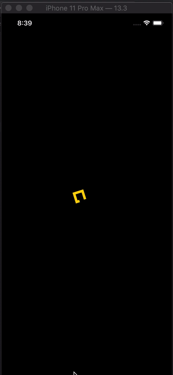
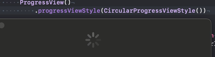
के रूप में Xcode 12 बीटा ( आईओएस 14 ) कहा जाता है, कोई नया दृश्य ProgressViewहै डेवलपर्स के लिए उपलब्ध है, और है कि दोनों नियत और अनिश्चित प्रगति प्रदर्शित कर सकते हैं।
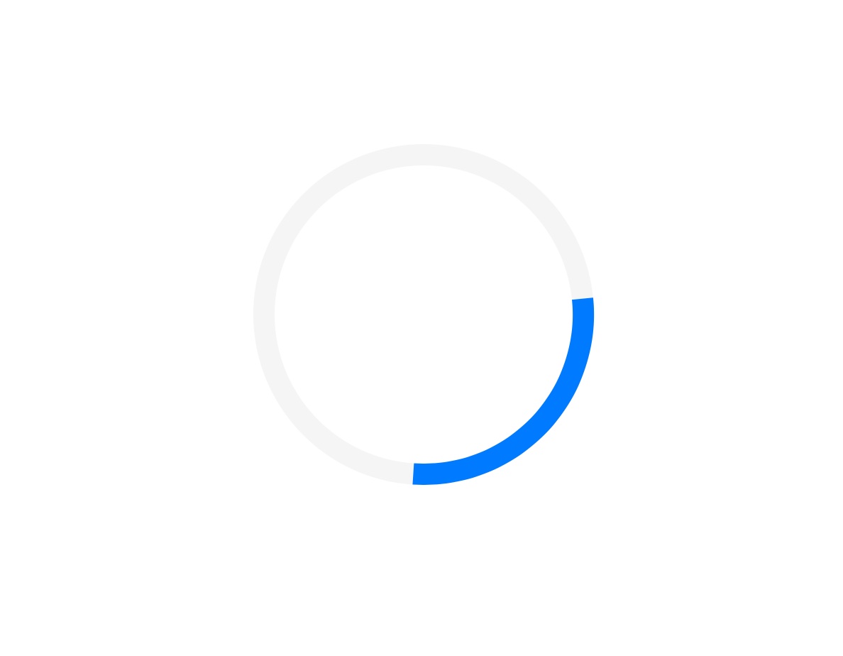
इसकी शैली को डिफॉल्ट करता है CircularProgressViewStyle, जो कि वास्तव में हम देख रहे हैं।
var body: some View {
VStack {
ProgressView()
}
}
Xcode 11.x
काफी कुछ विचारों को अभी तक प्रतिनिधित्व नहीं किया गया है SwiftUI, लेकिन उन्हें आसानी से सिस्टम में पोर्ट करना है। आपको UIActivityIndicatorइसे लपेटने और बनाने की आवश्यकता है UIViewRepresentable।
(इसके बारे में और अधिक जानकारी डब्ल्यूडब्ल्यूडीसी 2019 की बातचीत में मिल सकती है - एकीकृत स्विफ्टयूआई )
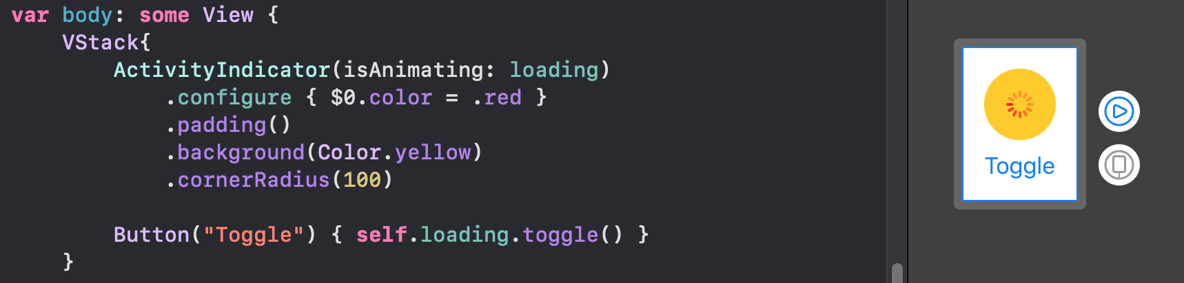
struct ActivityIndicator: UIViewRepresentable {

    @Binding var isAnimating: Bool
    let style: UIActivityIndicatorView.Style

    func makeUIView(context: UIViewRepresentableContext<ActivityIndicator>) -> UIActivityIndicatorView {
        return UIActivityIndicatorView(style: style)
    }

    func updateUIView(_ uiView: UIActivityIndicatorView, context: UIViewRepresentableContext<ActivityIndicator>) {
        isAnimating ? uiView.startAnimating() : uiView.stopAnimating()
    }
}
फिर आप इसे निम्नानुसार उपयोग कर सकते हैं - यहां एक लोडिंग ओवरले का एक उदाहरण है।
नोट: मैं उपयोग करना पसंद करता हूं ZStack, बजाय overlay(:_), इसलिए मुझे पता है कि वास्तव में मेरे कार्यान्वयन में क्या हो रहा है।
struct LoadingView<Content>: View where Content: View {

    @Binding var isShowing: Bool
    var content: () -> Content

    var body: some View {
        GeometryReader { geometry in
            ZStack(alignment: .center) {

                self.content()
                    .disabled(self.isShowing)
                    .blur(radius: self.isShowing ? 3 : 0)

                VStack {
                    Text("Loading...")
                    ActivityIndicator(isAnimating: .constant(true), style: .large)
                }
                .frame(width: geometry.size.width / 2,
                       height: geometry.size.height / 5)
                .background(Color.secondary.colorInvert())
                .foregroundColor(Color.primary)
                .cornerRadius(20)
                .opacity(self.isShowing ? 1 : 0)

            }
        }
    }

}
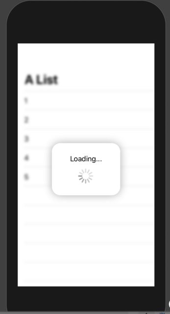
इसका परीक्षण करने के लिए, आप इस उदाहरण कोड का उपयोग कर सकते हैं:
struct ContentView: View {

    var body: some View {
        LoadingView(isShowing: .constant(true)) {
            NavigationView {
                List(["1", "2", "3", "4", "5"], id: \.self) { row in
                    Text(row)
                }.navigationBarTitle(Text("A List"), displayMode: .large)
            }
        }
    }

}
परिणाम: