एंड्रॉइड में एक प्रोग्रेस बार कैसे कस्टमाइज़ करें


160

मैं एक ऐप पर काम कर रहा हूं जिसमें मैं एक दिखाना ProgressBarचाहता हूं, लेकिन मैं डिफ़ॉल्ट एंड्रॉइड को बदलना चाहता हूं ProgressBar

तो मैं कैसे अनुकूलित कर सकते हैं ProgressBar?

क्या मुझे उसके लिए कुछ ग्राफिक्स और एनीमेशन की आवश्यकता है?

मैं निम्नलिखित पोस्ट पढ़ता हूं, लेकिन काम करने के लिए इसे प्राप्त नहीं कर सका:

कस्टम प्रगति बार Android


1
इस कस्टम प्रगति बार को आज़माएं ProgressWheel
नीरज किरोला

जवाबों:


300

ProgressBarअपनी प्रगति पट्टी की पृष्ठभूमि और प्रगति के लिए विशेषता या गुणों को परिभाषित करने के लिए एक आवश्यकता को अनुकूलित करना ।

customprogressbar.xmlअपने res->drawableफ़ोल्डर में नामित XML फ़ाइल बनाएँ :

custom_progressbar.xml

<layer-list xmlns:android="http://schemas.android.com/apk/res/android">

    <!-- Define the background properties like color etc -->
    <item android:id="@android:id/background">
    <shape>
        <gradient
                android:startColor="#000001"
                android:centerColor="#0b131e"
                android:centerY="1.0"
                android:endColor="#0d1522"
                android:angle="270"
        />
    </shape>
   </item>

  <!-- Define the progress properties like start color, end color etc -->
  <item android:id="@android:id/progress">
    <clip>
        <shape>
            <gradient
                android:startColor="#007A00"
                android:centerColor="#007A00"
                android:centerY="1.0"
                android:endColor="#06101d"
                android:angle="270"
            />
        </shape>
    </clip>
    </item>
</layer-list> 

अब आपको progressDrawableप्रॉपर्टी को customprogressbar.xml(ड्रॉबल) में सेट करना होगा

आप इसे XML फ़ाइल में या गतिविधि में (रन टाइम में) कर सकते हैं।

अपने XML में निम्न कार्य करें:

<ProgressBar
    android:id="@+id/progressBar1"
    style="?android:attr/progressBarStyleHorizontal"
    android:progressDrawable="@drawable/custom_progressbar"         
    android:layout_width="wrap_content"
    android:layout_height="wrap_content" />

रन टाइम पर निम्न कार्य करें

// Get the Drawable custom_progressbar                     
    Drawable draw=res.getDrawable(R.drawable.custom_progressbar);
// set the drawable as progress drawable
    progressBar.setProgressDrawable(draw);

संपादित करें: सही xml लेआउट


5
Res क्या है ?? res.getDrawable नहीं मिला
हिरेन

1
@irengamit Res "संसाधन" है। आपकी त्रुटि संभवतः संकेत दे रही है कि फ़ाइल नहीं मिल रही है। "C: /whereYourProjectFolderIs/res/drawable/customprogressbar.xml" <- नहीं पाया जा सकता है। यदि यह वहां है, तो अपने प्रोजेक्ट को "क्लीन" करने का प्रयास करें, यह संसाधन फ़ाइल को रीमेक करता है।
के - एसओ में विषाक्तता बढ़ रही है।

5
@ जॉनसन, रिस रिसोर्स के लिए खड़ा है। यदि आप ड्रा करने योग्य ड्रा के लिए लाइन की जगह लेते हैं = getResource ()। GetDrawable (R.drawable.custom_progressbar); यह काम करना चाहिए।
इरविन लेंग्केक

7
प्रगति को रनटाइम पर क्यों सेट करना आवश्यक है, जब यह xml फ़ाइल पर करना संभव है?
निकोलस एरियस

1
@ निकोलसएरियास शायद आप इसका स्वरूप बदलना चाहते हैं, किसी भी संभावित कारण से (जैसे "हरे रंग से बदलकर" प्रतिक्रिया की प्रतीक्षा में "लाल के रूप में" त्रुटि से निपटने के लिए ")
समुद्रतट

35

ProgressBarइस तरह के परिसर के मामले में ,

यहां छवि विवरण दर्ज करें

उपयोग करें ClipDrawable

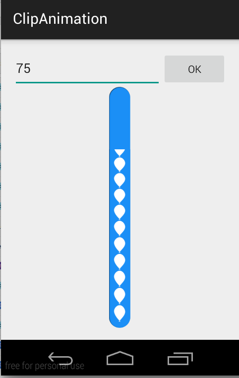
नोट: मैंने ProgressBarइस उदाहरण में यहाँ उपयोग नहीं किया है। मैंने इसे क्लिपड्राएबल का उपयोग करके प्राप्त किया है, जिसके साथ छवि को क्लिप किया जा सकता है Animation

एक है Drawableकि Drawableइस Drawableमौजूदा स्तर के मूल्य के आधार पर एक और क्लिप । आप यह नियंत्रित कर सकते हैं कि Drawableस्तर के आधार पर बच्चा चौड़ाई और ऊंचाई में कितना उलझा हुआ है, साथ ही यह नियंत्रित करने के लिए एक गुरुत्वाकर्षण है कि इसे अपने समग्र कंटेनर में कहां रखा गया है। Most often used to implement things like progress bars, के साथ drawable के स्तर को बढ़ाने के द्वारा setLevel()

नोट: ड्रॉबल पूरी तरह से क्लिप किया गया है और जब स्तर 0 है और पूरी तरह से पता चला है जब स्तर 10,000 है।

मैंने इसे बनाने के लिए इस दो छवियों का उपयोग किया है CustomProgressBar

scall.png

scall.png

ballon_progress.png

ballon_progress.png

MainActivity.java

public class MainActivity extends ActionBarActivity {

private EditText etPercent;
private ClipDrawable mImageDrawable;

// a field in your class
private int mLevel = 0;
private int fromLevel = 0;
private int toLevel = 0;

public static final int MAX_LEVEL = 10000;
public static final int LEVEL_DIFF = 100;
public static final int DELAY = 30;

private Handler mUpHandler = new Handler();
private Runnable animateUpImage = new Runnable() {

    @Override
    public void run() {
        doTheUpAnimation(fromLevel, toLevel);
    }
};

private Handler mDownHandler = new Handler();
private Runnable animateDownImage = new Runnable() {

    @Override
    public void run() {
        doTheDownAnimation(fromLevel, toLevel);
    }
};

@Override
protected void onCreate(Bundle savedInstanceState) {
    super.onCreate(savedInstanceState);
    setContentView(R.layout.activity_main);

    etPercent = (EditText) findViewById(R.id.etPercent);

    ImageView img = (ImageView) findViewById(R.id.imageView1);
    mImageDrawable = (ClipDrawable) img.getDrawable();
    mImageDrawable.setLevel(0);
}

private void doTheUpAnimation(int fromLevel, int toLevel) {
    mLevel += LEVEL_DIFF;
    mImageDrawable.setLevel(mLevel);
    if (mLevel <= toLevel) {
        mUpHandler.postDelayed(animateUpImage, DELAY);
    } else {
        mUpHandler.removeCallbacks(animateUpImage);
        MainActivity.this.fromLevel = toLevel;
    }
}

private void doTheDownAnimation(int fromLevel, int toLevel) {
    mLevel -= LEVEL_DIFF;
    mImageDrawable.setLevel(mLevel);
    if (mLevel >= toLevel) {
        mDownHandler.postDelayed(animateDownImage, DELAY);
    } else {
        mDownHandler.removeCallbacks(animateDownImage);
        MainActivity.this.fromLevel = toLevel;
    }
}

public void onClickOk(View v) {
    int temp_level = ((Integer.parseInt(etPercent.getText().toString())) * MAX_LEVEL) / 100;

    if (toLevel == temp_level || temp_level > MAX_LEVEL) {
        return;
    }
    toLevel = (temp_level <= MAX_LEVEL) ? temp_level : toLevel;
    if (toLevel > fromLevel) {
        // cancel previous process first
        mDownHandler.removeCallbacks(animateDownImage);
        MainActivity.this.fromLevel = toLevel;

        mUpHandler.post(animateUpImage);
    } else {
        // cancel previous process first
        mUpHandler.removeCallbacks(animateUpImage);
        MainActivity.this.fromLevel = toLevel;

        mDownHandler.post(animateDownImage);
    }
}
}

activity_main.xml

<LinearLayout xmlns:android="http://schemas.android.com/apk/res/android"
xmlns:tools="http://schemas.android.com/tools"
android:layout_width="match_parent"
android:layout_height="match_parent"
android:paddingLeft="16dp"
android:paddingRight="16dp"
android:paddingTop="16dp"
android:paddingBottom="16dp"
android:orientation="vertical"
tools:context=".MainActivity">

<LinearLayout
    android:layout_width="match_parent"
    android:layout_height="wrap_content"
    android:orientation="horizontal">

    <EditText
        android:id="@+id/etPercent"
        android:layout_width="0dp"
        android:layout_height="wrap_content"
        android:layout_weight="1"
        android:inputType="number"
        android:maxLength="3" />

    <Button
        android:layout_width="wrap_content"
        android:layout_height="wrap_content"
        android:text="Ok"
        android:onClick="onClickOk" />

</LinearLayout>

<FrameLayout
    android:layout_width="wrap_content"
    android:layout_height="wrap_content"
    android:layout_gravity="center">

    <ImageView
        android:id="@+id/imageView2"
        android:layout_width="match_parent"
        android:layout_height="match_parent"
        android:src="@drawable/scall" />

    <ImageView
        android:id="@+id/imageView1"
        android:layout_width="wrap_content"
        android:layout_height="wrap_content"
        android:src="@drawable/clip_source" />

</FrameLayout>

clip_source.xml

<?xml version="1.0" encoding="utf-8"?>
<clip xmlns:android="http://schemas.android.com/apk/res/android"
    android:clipOrientation="vertical"
    android:drawable="@drawable/ballon_progress"
    android:gravity="bottom" />

जटिल के मामले में HorizontalProgressBarबस इस तरह clip_source.xmlcliporientation में परिवर्तन करें,

android:clipOrientation="horizontal"

आप यहां से पूरा डेमो डाउनलोड कर सकते हैं


कोड वास्तव में दिलचस्प है, लेकिन यह मुझे img वस्तु पर nullpointer अपवाद देता है:
पार्थ अंजारिया

विजेट की आईडी ढूंढें, आपका अपवाद हल हो जाएगा।
विकाश शर्मा

34

अपने xml में

<ProgressBar
        android:id="@+id/progressBar1"
        android:layout_width="fill_parent"
        android:layout_height="wrap_content"
        style="@style/CustomProgressBar" 
        android:layout_margin="5dip" />

और में res/values/styles.xml:

<resources> 
        <style name="CustomProgressBar" parent="android:Widget.ProgressBar.Horizontal">
          <item name="android:indeterminateOnly">false</item>
          <item name="android:progressDrawable">@drawable/custom_progress_bar_horizontal</item>
          <item name="android:minHeight">10dip</item>
          <item name="android:maxHeight">20dip</item>
        </style>       
    <style name="AppTheme" parent="android:Theme.Light" />
</resources>

और custom_progress_bar_horizontalएक xml ड्रा करने योग्य फ़ोल्डर में संग्रहीत है जो आपके कस्टम प्रगति बार को परिभाषित करता है। अधिक विवरण के लिए इस ब्लॉग को देखें ।

उम्मीद है इससे आपको मदद मिलेगी।


10

स्पिनर प्रकार के मामले में क्रमशः प्रगतिबार के रंग को अनुकूलित करना एक xml फ़ाइल और उनके संबंधित जावा फ़ाइलों में कोड शुरू करने की आवश्यकता है।

एक xml फ़ाइल बनाएँ और इसे प्रगतिबार के रूप में नाम दें

<?xml version="1.0" encoding="utf-8"?>
<LinearLayout xmlns:android="http://schemas.android.com/apk/res/android"
    xmlns:tools="http://schemas.android.com/tools"
    android:layout_width="wrap_content"
    android:layout_height="wrap_content"
    android:gravity="center"
    tools:context=".Radio_Activity" >

    <LinearLayout
        android:id="@+id/progressbar"
        android:layout_width="wrap_content"
        android:layout_height="wrap_content" >

        <ProgressBar
            android:id="@+id/spinner"
            android:layout_width="wrap_content"
            android:layout_height="wrap_content" >
        </ProgressBar>
    </LinearLayout>

</LinearLayout>

स्पिनर को विभिन्न अपेक्षित रंग प्राप्त करने के लिए निम्नलिखित कोड का उपयोग करें। कहीं हम नीले रंग में स्पिनर प्रदर्शित करने के लिए हेक्सकोड का उपयोग नहीं करते हैं।

Progressbar spinner = (ProgressBar) progrees.findViewById(R.id.spinner);
spinner.getIndeterminateDrawable().setColorFilter(Color.parseColor("#80DAEB"),
                android.graphics.PorterDuff.Mode.MULTIPLY);

क्या पूरे एप्लिकेशन के लिए इस रंग फ़िल्टर को सेट करने का कोई तरीका है, मेरा मतलब है कि हर प्रगति पट्टी में, इसे शैलियों या sth में सेट करना पसंद है? thnx
ह्यूगो

8

दो प्रकार के प्रगति बार होते हैं जिन्हें प्रगति पट्टी (निश्चित अवधि) और अनिश्चितकालीन प्रगति पट्टी (अज्ञात अवधि) कहा जाता है।

प्रगति पट्टी के दोनों प्रकारों के लिए ड्रॉबल को xml संसाधन के रूप में ड्रिबल को परिभाषित करके अनुकूलित किया जा सकता है। आप प्रगति बार शैलियों और अनुकूलन के बारे में अधिक जानकारी http://www.zoftino.com/android-progressbar-and-custom-progressbar-examples पर प्राप्त कर सकते हैं ।

कस्टमाइज़्ड फिक्स्ड या हॉरिज़ॉन्टल प्रोग्रेस बार:

नीचे xml क्षैतिज प्रगति बार अनुकूलन के लिए एक उल्लेखनीय संसाधन है।

 <?xml version="1.0" encoding="utf-8"?>
<layer-list xmlns:android="http://schemas.android.com/apk/res/android">
    <item android:id="@android:id/background"
        android:gravity="center_vertical|fill_horizontal">
        <shape android:shape="rectangle"
            android:tint="?attr/colorControlNormal">
            <corners android:radius="8dp"/>
            <size android:height="20dp" />
            <solid android:color="#90caf9" />
        </shape>
    </item>
    <item android:id="@android:id/progress"
        android:gravity="center_vertical|fill_horizontal">
        <scale android:scaleWidth="100%">
            <shape android:shape="rectangle"
                android:tint="?attr/colorControlActivated">
                <corners android:radius="8dp"/>
                <size android:height="20dp" />
                <solid android:color="#b9f6ca" />
            </shape>
        </scale>
    </item>
</layer-list>

अनिश्चित प्रगति पट्टी को अनुकूलित करना

नीचे xml परिपत्र प्रगति बार अनुकूलन के लिए एक उल्लेखनीय संसाधन है।

<?xml version="1.0" encoding="utf-8"?>
<layer-list xmlns:android="http://schemas.android.com/apk/res/android">
    <item android:id="@android:id/progress"
        android:top="16dp"
        android:bottom="16dp">
                <rotate
                    android:fromDegrees="45"
                    android:pivotX="50%"
                    android:pivotY="50%"
                    android:toDegrees="315">
                    <shape android:shape="rectangle">
                        <size
                            android:width="80dp"
                            android:height="80dp" />
                        <stroke
                            android:width="6dp"
                            android:color="#b71c1c" />
                    </shape>
                </rotate>           
    </item>
</layer-list>

5

हॉटस्टार की तरह कस्टम प्रोग्रेसबार बनाना।

  1. लेआउट फ़ाइल पर प्रगति पट्टी जोड़ें और ड्रा करने योग्य फ़ाइल के साथ अनिश्चित सेट करें।

activity_main.xml

<ProgressBar
    style="?android:attr/progressBarStyleLarge"
    android:layout_width="wrap_content"
    android:layout_height="wrap_content"
    android:layout_centerVertical="true"
    android:layout_centerHorizontal="true"
    android:id="@+id/player_progressbar"
    android:indeterminateDrawable="@drawable/custom_progress_bar"
    />
  1. Res \ drawable में नई xml फ़ाइल बनाएँ

custom_progress_bar.xml

<?xml version="1.0" encoding="utf-8"?>
    <rotate  xmlns:android="http://schemas.android.com/apk/res/android"
    android:duration="2000"
    android:fromDegrees="0"
    android:pivotX="50%"
    android:pivotY="50%"
    android:toDegrees="1080" >

    <shape
        android:innerRadius="35dp"
        android:shape="ring"
        android:thickness="3dp"
        android:useLevel="false" >
       <size
           android:height="80dp"
           android:width="80dp" />

       <gradient
            android:centerColor="#80b7b4b2"
            android:centerY="0.5"
            android:endColor="#f4eef0"
            android:startColor="#00938c87"
            android:type="sweep"
            android:useLevel="false" />
    </shape>

</rotate>

4

Android में प्रगति बार को अनुकूलित करने का सबसे सरल तरीका:

  1. आरंभ और संवाद दिखाएं:

    MyProgressDialog progressdialog = new MyProgressDialog(getActivity());
    progressdialog.show();
  2. विधि बनाएँ:

    public class MyProgressDialog extends AlertDialog {
          public MyProgressDialog(Context context) {
              super(context);
              getWindow().setBackgroundDrawable(new ColorDrawable(android.graphics.Color.TRANSPARENT));
          }
    
          @Override
          public void show() {
              super.show();
              setContentView(R.layout.dialog_progress);
          }
    }
  3. लेआउट XML बनाएँ:

    <RelativeLayout xmlns:android="http://schemas.android.com/apk/res/android"
      xmlns:tools="http://schemas.android.com/tools"
      android:layout_width="match_parent"
      android:layout_height="match_parent"
      android:background="@android:color/transparent"
      android:clickable="true">
    
        <RelativeLayout
             android:layout_width="wrap_content"
             android:layout_height="wrap_content"
             android:layout_centerInParent="true">
    
          <ProgressBar
             android:id="@+id/progressbarr"
             android:layout_width="@dimen/eightfive"
             android:layout_height="@dimen/eightfive"
             android:layout_centerInParent="true"
            android:indeterminateDrawable="@drawable/progresscustombg" />
    
          <TextView
             android:layout_width="wrap_content"
             android:layout_height="wrap_content"
             android:layout_centerHorizontal="true"
             android:layout_below="@+id/progressbarr"
             android:layout_marginTop="@dimen/_3sdp"
             android:textColor="@color/white"
             android:text="Please wait"/>
        </RelativeLayout>
    </RelativeLayout>
  4. आकृति क्रमाकुंचित करें। Xml बनाएं और Res / drawable डालें:

    <?xml version="1.0" encoding="utf-8"?>
    <rotate xmlns:android="http://schemas.android.com/apk/res/android"
      android:fromDegrees="0"
      android:pivotX="50%"
      android:pivotY="50%"
      android:toDegrees="360" >
    
        <shape
           android:innerRadiusRatio="3"
           android:shape="ring"
           android:thicknessRatio="20"
           android:useLevel="false" >
            <size
                android:height="@dimen/eightfive"
                android:width="@dimen/eightfive" />
    
            <gradient
                android:centerY="0.50"
                android:endColor="@color/color_green_icash"
                android:startColor="#FFFFFF"
                android:type="sweep"
                android:useLevel="false" />
        </shape>
    
    </rotate>

3

कस्टम दराज का उपयोग करने के लिए:

<?xml version="1.0" encoding="utf-8"?>
<rotate xmlns:android="http://schemas.android.com/apk/res/android"
android:fromDegrees="0"
android:toDegrees="360"
android:drawable="@drawable/my_drawable"
android:pivotX="50%"
android:pivotY="50%" />

(res / drawable के तहत जोड़ें progress.xml)। my_drawablexml, png हो सकता है

फिर अपने लेआउट उपयोग में

<ProgressBar
        android:id="@+id/progressBar"
        android:indeterminateDrawable="@drawable/progress_circle"
...
/>

1
यह सबसे अच्छा जवाब है जो मैंने कभी देखा है। आकर्षण की तरह काम करता है। धन्यवाद
राजेश्वर

1

यदि आप कोड में ऐसा करना चाहते हैं, तो यहां एक नमूना है:

pd = new ProgressDialog(MainActivity.this);
pd.setProgressStyle(ProgressDialog.STYLE_SPINNER);
pd.getWindow().setBackgroundDrawable(new ColorDrawable(Color.TRANSPARENT));
pd.getWindow().setGravity(Gravity.CENTER_HORIZONTAL|Gravity.CENTER_VERTICAL);
TextView tv = new TextView(this);
tv.setTextColor(Color.WHITE);
tv.setTextSize(20);
tv.setText("Waiting...");
pd.setCustomTitle(tv);
pd.setIndeterminate(true);
pd.show();

TextView का उपयोग करने से आपको अपने पाठ का रंग, आकार और फ़ॉन्ट बदलने का विकल्प मिलता है। अन्यथा आप हमेशा की तरह सेटमैसेज () कॉल कर सकते हैं।

हमारी साइट का प्रयोग करके, आप स्वीकार करते हैं कि आपने हमारी Cookie Policy और निजता नीति को पढ़ और समझा लिया है।
Licensed under cc by-sa 3.0 with attribution required.